One identity unites the café’s menu, space and website
Client
Ňun Café
A complete visual identity, print and website connected by one visual language. Guests recognise the same style in the menu, on the wall and online.
Scope of Work
Web Design
Framer Development
Graphic Design
Branding

A menu designed to be held
The entire menu system uses one visual language. Drinks, desserts and seasonal menus share the same style, so customers can find their way around the offer in seconds—and, most importantly, work up an appetite.


Print materials in one consistent style
Posters, flyers and seasonal campaigns follow the same visual language as the menu. Everything belongs together, so every printed piece strengthens the brand.

An identity that lives in the space
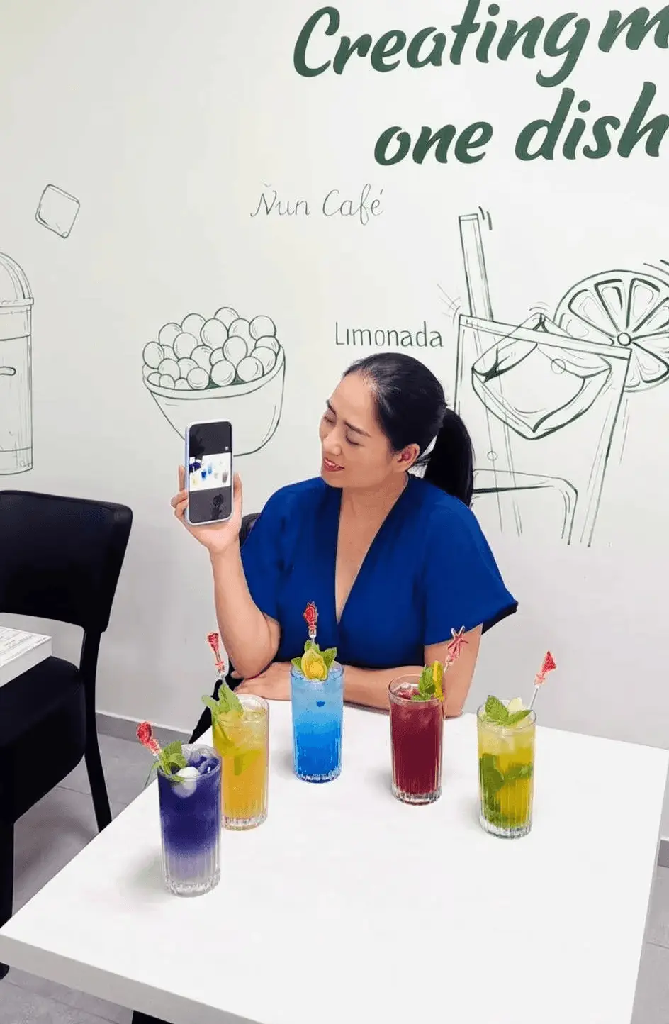
The visual style does not stop at paper. A wall illustration brings the brand’s character directly into the café and gives guests the feeling of a place with its own story.


A website with the same tone
The website brings the café’s atmosphere online. A clear menu, easy-to-find locations and the same style customers know from the space. The first impression online matches what awaits them at the table.


Details to take home
The loyalty card and product graphics share the same expression as the rest of the brand. These small details are what customers carry away in their hands and remember.

Motion that brings the brand to life
Short videos and subtle motion bring the brand to life beyond static materials. The same calm feeling and the same style, now in motion.
We worked with David on both the visual identity and website for Ňun Café. He immediately understood how the café should feel. Communication was direct and fast.
Nhung N.
Ňun Café

